The Artful Process
Getting crafty with clay
OVERVIEW
Whenever there's a vendor market in town— I'm there.
And a long-time dream of mine had been to one day open my own shop selling my creations. This dream began to come to life in late 2021 after I was selected as one of ten women to participate in Northeastern WISE's Thought Incubator. In January 2022, my online shop officially opened selling handmade jewelry stands, earrings, prints, and home decor.

MY ROLE
This project was a personal labor of love in which I created all the products, designed the branding, executed all of the marketing, packaged the orders, and managed the booth at markets.
AREAS OF FOCUS – CASE STUDIES
Click to learn more or continue scrolling.
PRODUCT DESIGN
I needed a new way to store and display my jewelry
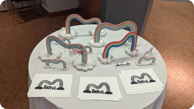
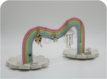
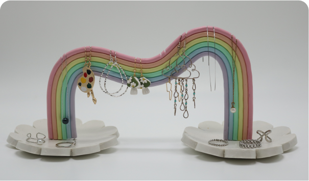
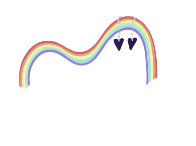
It all started with an idea, some sketches, and a lot of craft supplies. The concept was a 3-dimensional rainbow that could act as both a jewelry stand and ring dishes all at the same time. A method of storing jewelry that was a statement piece itself.
The first prototype
Now this was the tricky part. I had made small figurines and a couple pairs of earrings out of clay before, but nothing quite like this. My first attempt left something to be desired, and it had taken a fall in the oven, but it taught me an incredible amount.
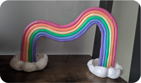
add spots to hold earrings in place
change to pastel colors
make clouds larger for more storage
bake rainbow seperately from clouds
more consistent widths + thinner
Try, try, and try again
Each attempt was better than the last and revealed new areas of improvement. I was slowly chipping away at both the visual aesthetic as well as the functionality and practicality of the piece.
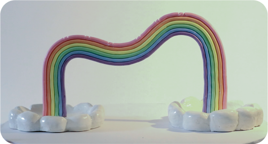
maybe a little more pastel
make clouds less... bumpy
make the rainbow detachable from the clouds
Each attempt was tested to see how well it performed
Tested by my friends, peers, and myself, who all had sizable jewelry collections. Testers would take the rainbow home for a week and use it to hold and display their jewelry, then they would submit a form answering questions about their experience.
Putting feedback into action
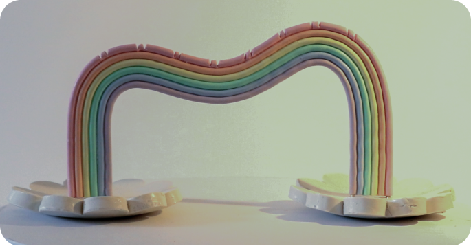
From the sample of those who tested the Rainbow, it was clear that the visual aesthetic performed well, but the functionality could still use some more work. Utilizing the feedback:
- Changed the protective clear coat to remove the sticky consistency from the outside
- Deepened the slits to provide more grip to ensure jewelry was less likely to slip
- Altered the assembly method to make it easier to attach/detach the rainbow from the clouds
BRAND IDENTITY
Designing the brand behind the product
The branding behind the Rainbow products had to convey a cohesive message: handmade, colorful, and fun. But it also needed to be practical given the resource constraints of my small business. The core elements of focus were: a name, logo, and colors.
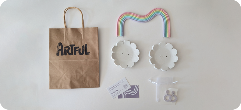
Creating custom typography
After deciding on the name “Artful” for my business, I knew creating a unique logo with custom typography was a priority. I practiced sketching the word over and over again in different styles until I tried a bubbly and more organic approach.
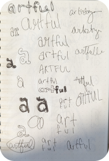
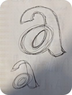
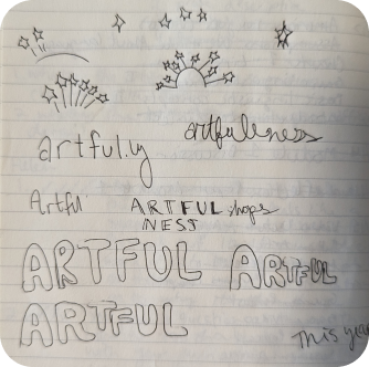
Digitizing & refining
I really wanted to emphasize the handmade and unique elements of the brand through custom typography. After a lot of sketching, the more organically shaped block letters started to call out to me.


Incorporating the rainbow shape into the branding
Each attempt was better than the last and revealed new areas of improvement. I was slowly chipping away at both the visual aesthetic as well as the functionality and practicality of the piece.
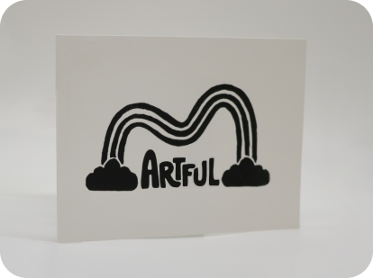
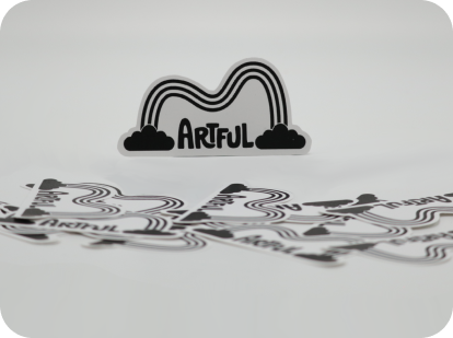
Putting it all together
The goal with Artful was to create a colorful and fun experience for jewelry owners. To learn more about this project, read this article from The Huntington News.
